Flash Card
Gamified Credit Card Rewards
Are credit card benefits even worth it?
Quick Summary
I was recently out of the country, I was using a lot of my credit card benefits to finance the trip (specifically the flight as well as some hotel accommodations). I had more struggles than I anticipated in using my credit card benefits in the way that I wanted. My goal is to come up with a solution for the struggles I encountered.
The problem originated as a personal one, but through research and analysis I was able to target key pain points to solve the problem in a lean approach for many users like me.
*yellow highlight is to aid in speedy scan-ability
Problem:
Complexity in redeeming credit card rewards is causing users to miss out on the rewards they deserve.
Understanding the Problem
Credit card rewards programs in general are a math problem. It's about understanding and gaming the system that may be more complex than it needs. As profit is directly correlated to the use of rewards, there are always slight restrictions that make things a little bit more complex. There wouldn't be businesses such as NerdWallet, ThePointsGuy and multiple Youtube/TikTok Channels in analyzing how to maximize use of benefits if the programs were simplified.
Goal: Make points super simple to use 🔑
Flash Card

Problem in context
- I was out of the country
- I used points to buy the initial flight
- I needed to change the return flight
- There was a $300 change in price for flight
- I wanted to pay for the change fee in points
- I was unable to use my points for the change (points were available
- I wanted to find a hotel to use my points at in another city
- Using points for the hotel made selection of hotel difficult
- Difficult user experience in selecting what was available.
Research
Market Research What does finding the right card with right benefits program look like?
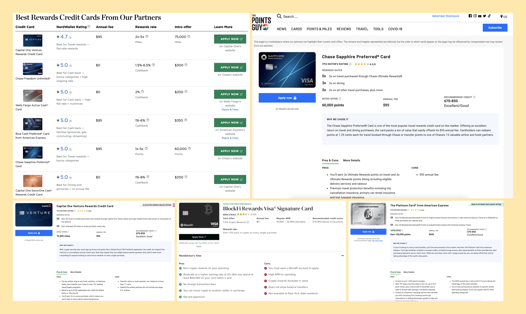
Analyzing the right card for you, in even the best design setting is complex, it's a math problem.
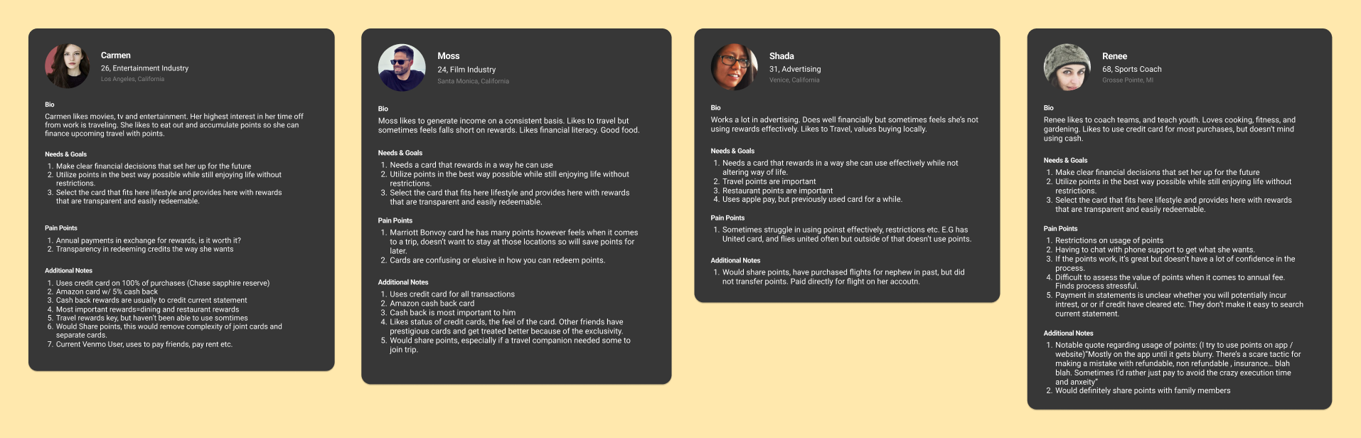
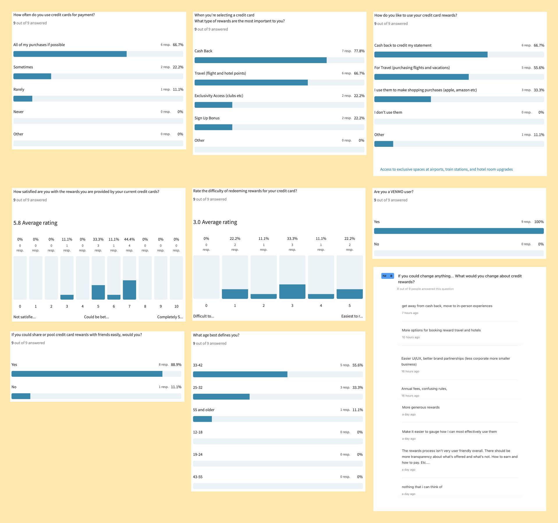
User Interviews I chose user interviews as the method because it allowed me to get the most breadth of credit card use, the pain points and ability to elaborate on wins and fails with current credit cards in the market.
Summary of User Interviews (4 people)
- Cash back rewards are important, usually used to credit current statement
- Travel rewards (flights) are important
- Users have purchased flights for friends before but through their account
- Status is important to one user
- There isn’t a lot of confidence in being able to use points (lack of transparency)
- There is confusion on whether a card is worth it based on annual fee and the benefits used.
- People would share benefits.
Survey Typeform survey was a good way to get some more random users outside of my own network and get exact answers. Summary of Typeform Survey (10 people)
- Cash Back and Travel rewards are most important
- There is some struggle in redeeming rewards the way users want, people are capable of doing it though.
- Users like to use products like venmo (90% users)
- Users would share points if it were an option (90% users)
Mapping
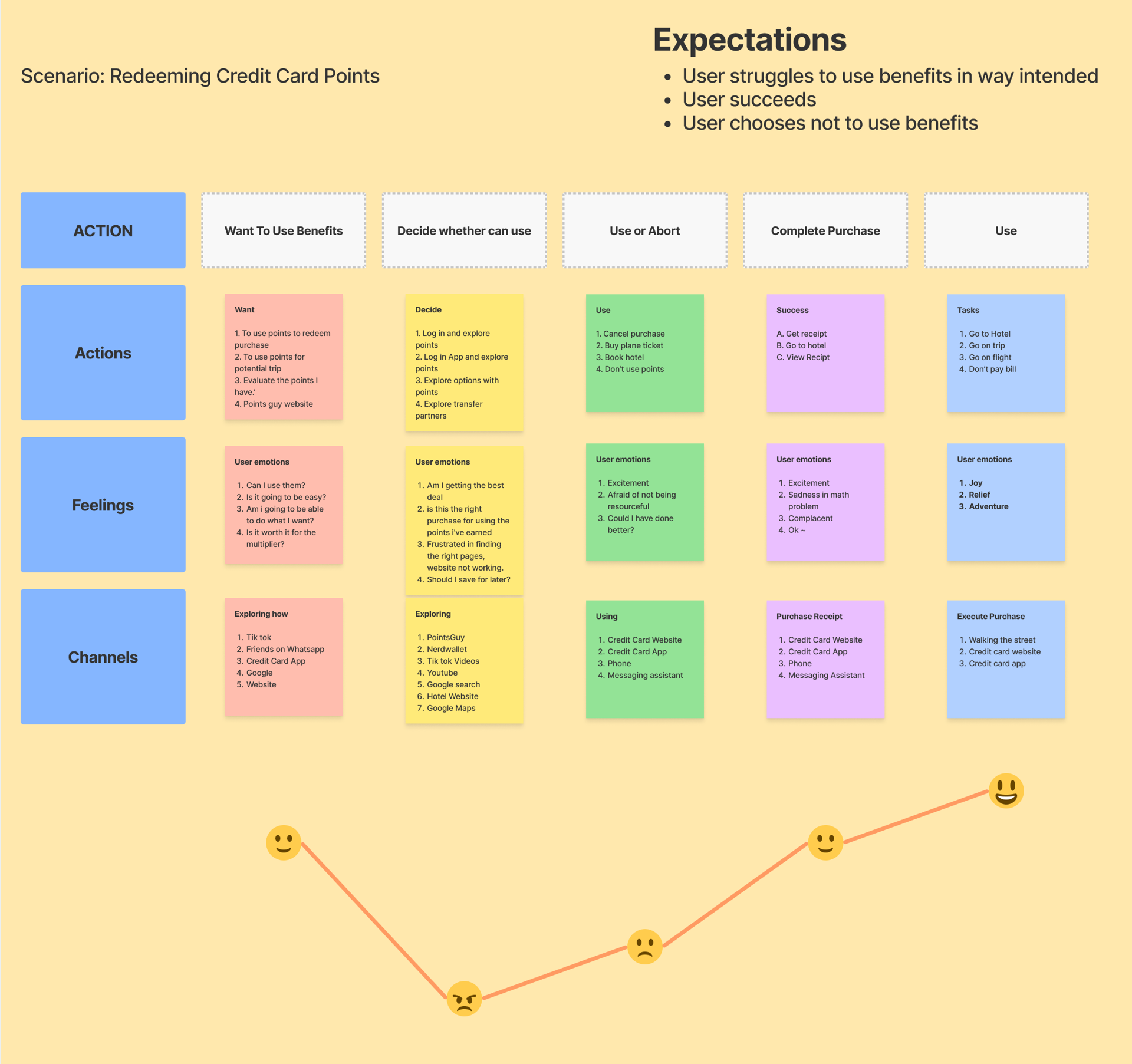
Mapping out the journey in redeeming credit card points for a user.
One of the key pain points is the emotion when a user is unsure if they can use the points in the way that they intended. This involves a lot of research and math to understand whether it was the right purchase or not. Not full satisfaction until completion of redemption of points. Key point: Confidence in knowing the purchase is complete is key, as well as transparency that the points are mathematically worth it.
Insights
What to optimize for
In user interviews as well as tyepform survey results it became clear that users weren't fully satisfied with the ease of redeeming credit card rewards, as well as the transparency in how they can be used. There is some levels of manipulation in numbers that make it feel like a math problem (specifically with having an annual fee with high rewards that make it seem equal). People want simple solutions, instant satisfaction is key in cash back rewards vs having to jump through hoops and hit potential restrictions. Some users keep building up rewards with intent to use them, but never actually end up doing so.
- Cash back rewards are important to users (need to be easy to redeem)
- Travel Rewards are important
- Users would share points if it were an option
- Users like to use venmo
- There needs to be clarity in rewards and how they can be used simply. (Transparency)
- Differentiators from other cards to consider:
- Something to provides network effects, social elements
- Add a level of fun to it.
- Gamification has never been done very well
- Remove the math
Who are we designing for?
Early Credit Card Adopter
- College Student (18-26)
- Newer to credit cards
- Values rewards / cash back
- Current venmo user
- Values transparency and simplicity
- Lives in metropolitan area

What do users need?
Ease of use in cash back benefits + Transparency in use of points
Both personas would need a level of ease of use. It can't be the key differentiator of card, but something that users feel a level of transparency in points in earning them and using them (cash back rewards). Being able to use points right away could be a way to attract both types of users (sharing points with sign up incentive). It moves into the realm of gamification and fun associated with cards.
Constraints: Some additional things to keep in mind (startup mindset)
- Must differentiate from the market
- Must be competitive in market
- Must be able to launch in a lean way (startup mvp)
- Must have a way of easily spreading using network effects
Potential Solutions:
- Make using rewards super simple with mobile interface
- Showcase realtime rewards - make users feel like a purchase was redeemed instantly
- Make points shareable among users
- Make cash back % > 3% for all purchases
- Design a whole new cryptocurrency for a credit card
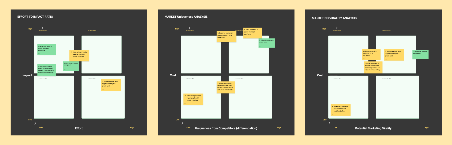
Evaluation of Solutions:
1. Low Effort / High Impact (left)
Make using rewards super simple with mobile interface
2. Market Uniqueness / Cost (middle)
Make points shareable among users
If executed in a clever way, this would definitely be the most unique feature available.
3. Marketing Virality / Cost (right) Make points shareable among users
By making points shareable, you make each event of sharing points a potential event for marketing and virality. This would be super important in the early days of a startup and getting off the ground.
Solution: Make points shareable among users 🔥👍
Evidence: This is the Highest impact solution with highest differentiation as a minimum viable product. It solves for insights:
- Transparency - By sharing with friends, you know how your benefiits work immediately.
- Cash Back Rewards - You can instantly share with friends, ease of redemption, realtime This also aligns with instant redeeming of purchases as it presents th same value.
- Ease of redemption - Simple to redeem benefits
- Relateable - Venmo type experience with sharing
- Perk - Virality - Each transaction gives an opportunity to share experience on social and get network effects
CONS: It would increase the use of rewards, which is likely the reason other card offerers do not allow this feature (as it’s more profitable if users do not use rewards).
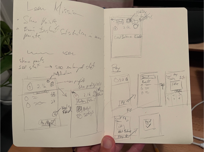
Sketching and Ideation
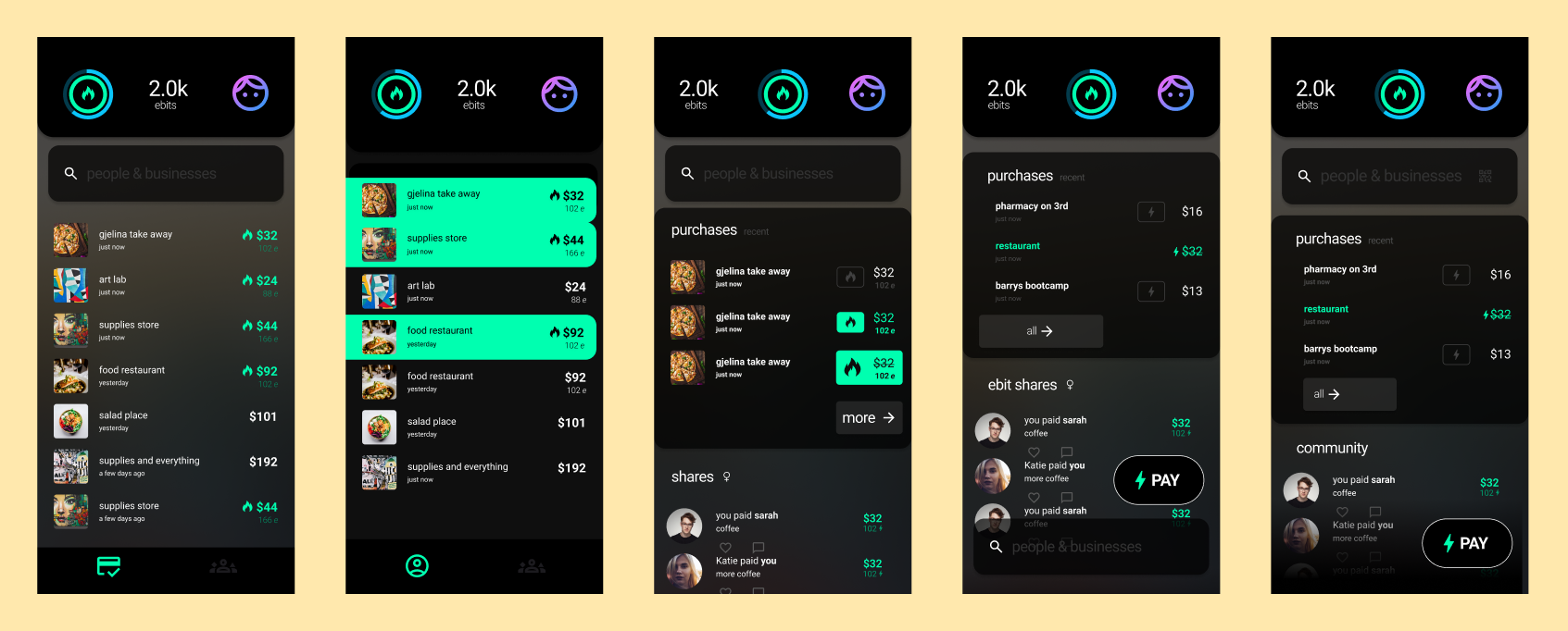
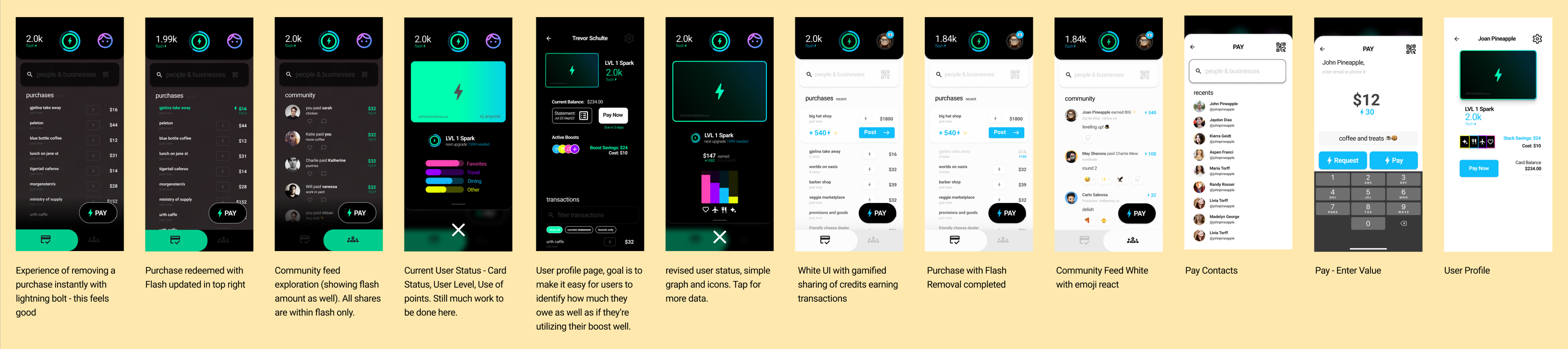
Some early wireframes with the concept of shareability (community), transparency and ease of use on mind. I wanted to explore some levels of fun and gamification with points- this would create a situation for users where it doesn't feel fully business style like most credit cards. I did this with adding a flame icon to the card (status level that you can continue to earn. This also applies a level of transparency because you know exactly what status you're at with points.
Mapping it out
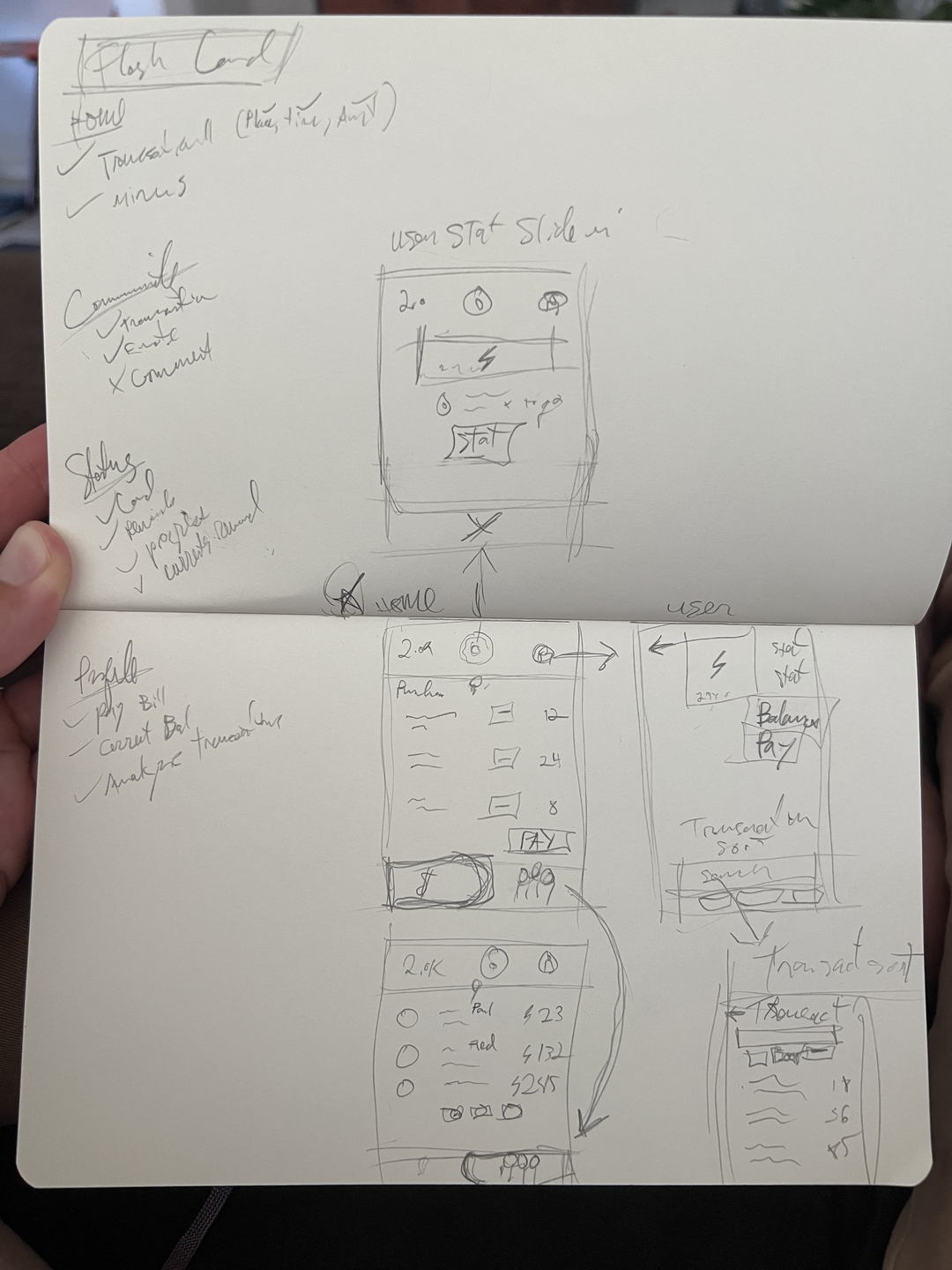
Potential features and requirements
I apply solving user pain points - Make shareable points, transparency in points usage. Then follow up with needs for the user. I like to list out things as what I might want as a user, then filtering that down to what I need as a user in the most simple form (mvp), then simplifying further in what I need for each individual screen.
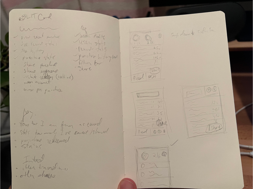
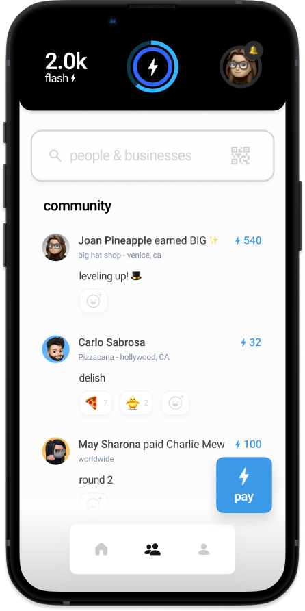
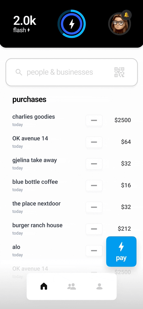
The Feed - Displaying Transactions Needs: Display transaction Display shared transactions Display redeemed transactions Transaction details: Amount, Location, Time, Status Wants: Sift through transactions by type Search through transactions by name
Transparency in Points
Goal: Show points in a meaningful way that feels safe and touchable for user.
I wanted to create a way where you visibly see points and your current status at any time without feeling like I might tap something else (touch luxury).
Not unlike a game, I want to know my status level, points, and a progress amount that shows how much it will take to get to the next level.
- How many points user currently has?
- How many have they earned within a period?
- What purchase categories?
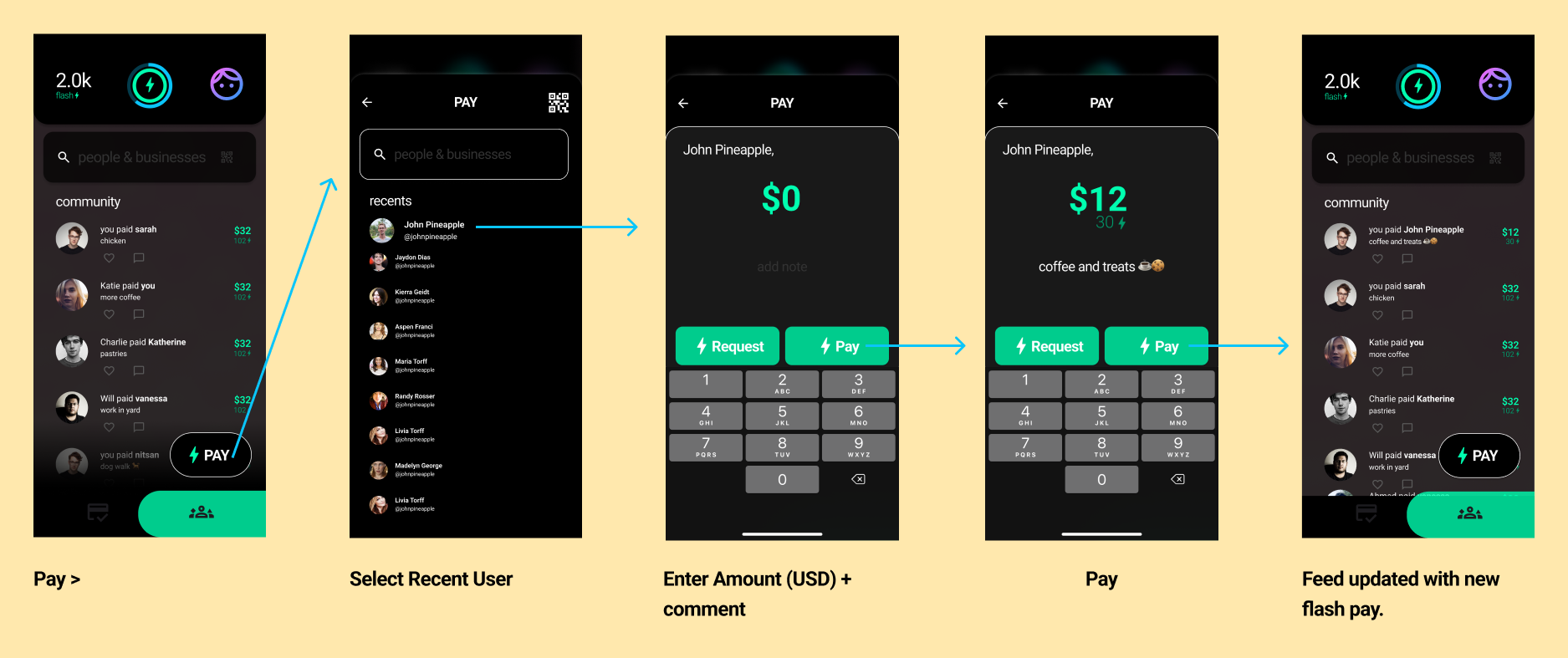
Pay / Share Points
Designing a flow in sharing points within the community to make it a simple and fun experience.
Both Venmo and CashApp are inspirations for this
- Use of QR code
- Searchability for users to share points with
- Showing translation between USD and Points
Wireframing
An initial pass on wireframing
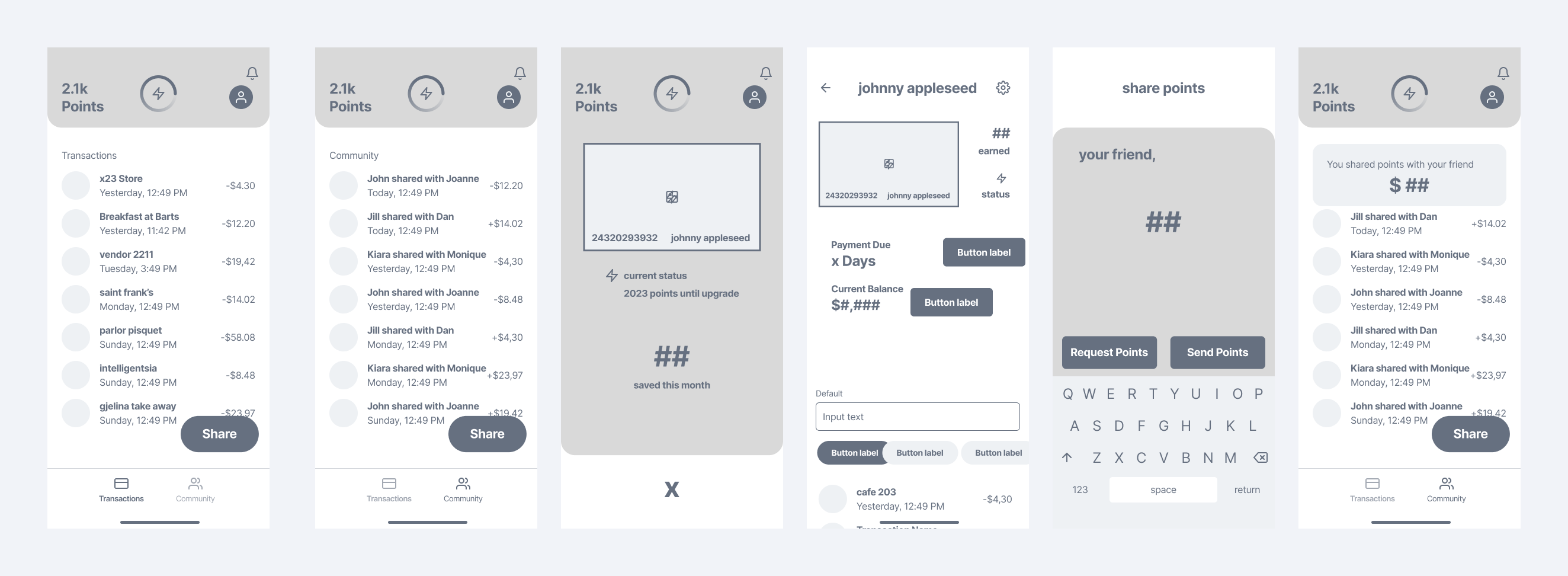
Wireframe User Feedback
Positive 👍
- Different spin on a card, seems fun
- Liked disappearing purchases
- Liked knowing current point value at top
Negative 👎
- Share button is a little confusing, share what?
- Top button doesn't seem clickable, what does clicking lightning bolt do?
- Top Ring, what does it mean?
- [Payment complete amount is confusing] looking too long at this.
Wireframing - test feedback refinements
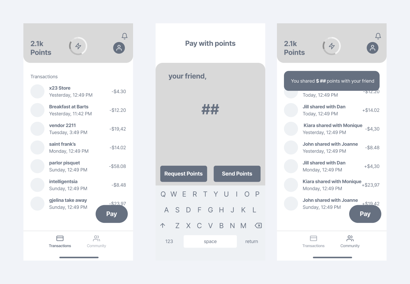
👍 These wireframes tested well, majority percentage of users were able to execute a payment successfully and saw it being shared to community
Wireframing - test feedback refinements 2
Further testing showcasing disappearing purchases feature (immediate cash back - transparency insight)
Positive 👍
- Users understood subtracting of purchases with minus sign. Needed a little direction (onboarding could help)
Additional feedback.
Negative 👎
- User profile page is a little confusing clicking profile image at top it seems important.
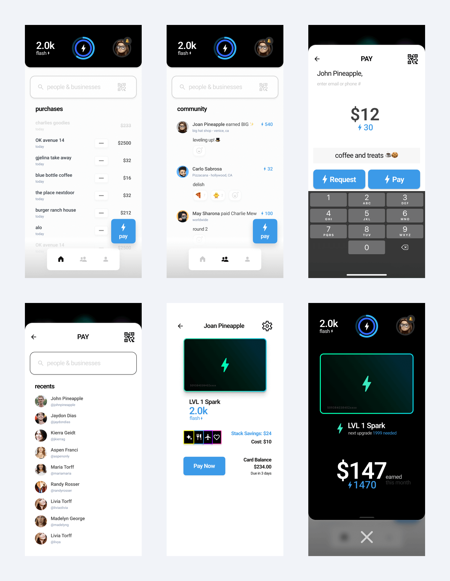
Style - Explorations in fintech type apps and color schemes
Hi Fidelity
HiFi Iteration 1 - Exploring styles of removing purchases + dockless
- I explored several ways in showing removed purchases. The goal is to immediately signal to the user that a purchase was removed.
- It was a little confusing without the dock as much as it seemed cleaner in the beginning.
HiFi Iteration 2 - Pay a user flow
- Explored the making a payment and populating the social feed (for network effects)
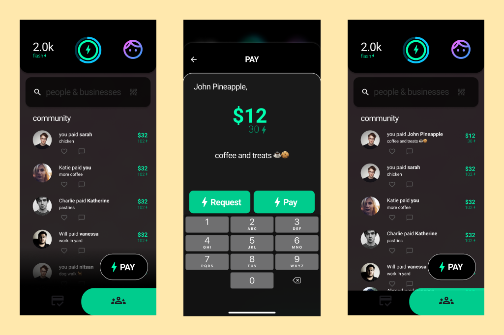
Payment User Flow
I wanted something super simple in only a few taps. Optimizing for contacts use early in onboarding will be key to easy selection of friends, but the QR code would aid in anyone that didn't want to add contacts. One key thing to think about was the translation of dollars to flash points. I felt the dollar made the most sense to be more prominent. You need to remove the math for the user.
Rapid iterations in UI
Some explorations that went along with testing in prototype. Annotations below image. As much as I loved supporting the dark mode style, it just didn't feel as serious of an app in fintech without the lighter color. Gamified is a good thing, but only to an extent.
A/B Test on Color
In comparing the Dark mode UI with Light mode UI, 7/10 users chose light mode.
**This selection also helped in modifying colors to meet accessibility needs
Tester Quote
"The white just makes me feel a little safer given it's my money and it is important to me"
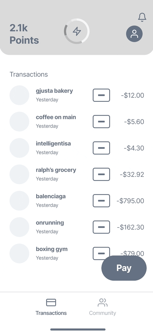
Flash Card
Conclusion
While this is the early stages of the product, I see a lot of potential of where it can evolve into. With 90% of users favoring shareability, a mix of gamification, network effects and finance could evolve well together. Insights solved for: Shareability - Users can share benefits with friends, instant satisfaction in using benefits Cash Back Rewards - Users can share and subtract purchases instantly Ease of Redemption - By sharing, and assignign a value to purchases, you know the value right away. Transparency - Points are shown at top of app, you know value by sharing with friends and subtracting purchases. Success!
Wrapping It Up 🎁
How did users respond?
Prototype testers responded well, mostly to the disappearing purchases element and the feeling of knowing their status at all times(card and earned benefits in a month). People unsure on community in sharing a purchase but I think that can evolve.
What's next?
I want to build an MVP of the app, It is needed to find someone strong in the financial space to partner with as well as the engineering side. I've reached out to another founder of a credit card app and he was focusing on a similar space (optimizing for best rewards based on card though).
Challenges and Learnings
Challenges and Learnings Sometimes talking about finance with people can feel a little touchy or intrusive but people do like to learn what is out there and potentially optimizing for it. It was interesting to learn about buying behavior. Was surprised that cash back was so important as it tends to be less than travel benefits in my experience.
What would you change?
More research with younger potential users to better understand what their needs and interests are.